Dashboard
The Four Numbers You Get Asked For
Open the project and this is the first screen. It is designed to answer a corridor question in about three seconds. Across the top: planned hours, weighted percent complete, tasks complete and open gates, plus planned cost for roles with Financials access. Below them sit boxes you can show, hide, drag into order and resize, and the page refreshes on its own while it is open.
Phase Progress
One bar per phase in your plan, each rolled up from the percent complete on its tasks and weighted by planned hours. The shape of the bars tells you whether you have a project running late or a project running out of order.
Readiness Donut
The weighted go/no-go score with its chip beside it, on the same screen as everything else, so readiness is not something you go and look at once near the end. See how it is scored →
Running several engagements? The same numbers roll up across all of them. Portfolio dashboards →
Engagement Health
The automatic RAG status beside open risks, open P1 defects, migration objects not yet reconciled, tasks complete, open gates and hours burned, with a warning when hours run well ahead of progress. Hours Tracking and Top Open Risks boxes sit alongside it.
Your Own Charts
Add any custom query as its own box, shown as a table or as a bar, line or pie chart. Custom queries →
Status Report
You Write the Judgement, It Writes the Facts
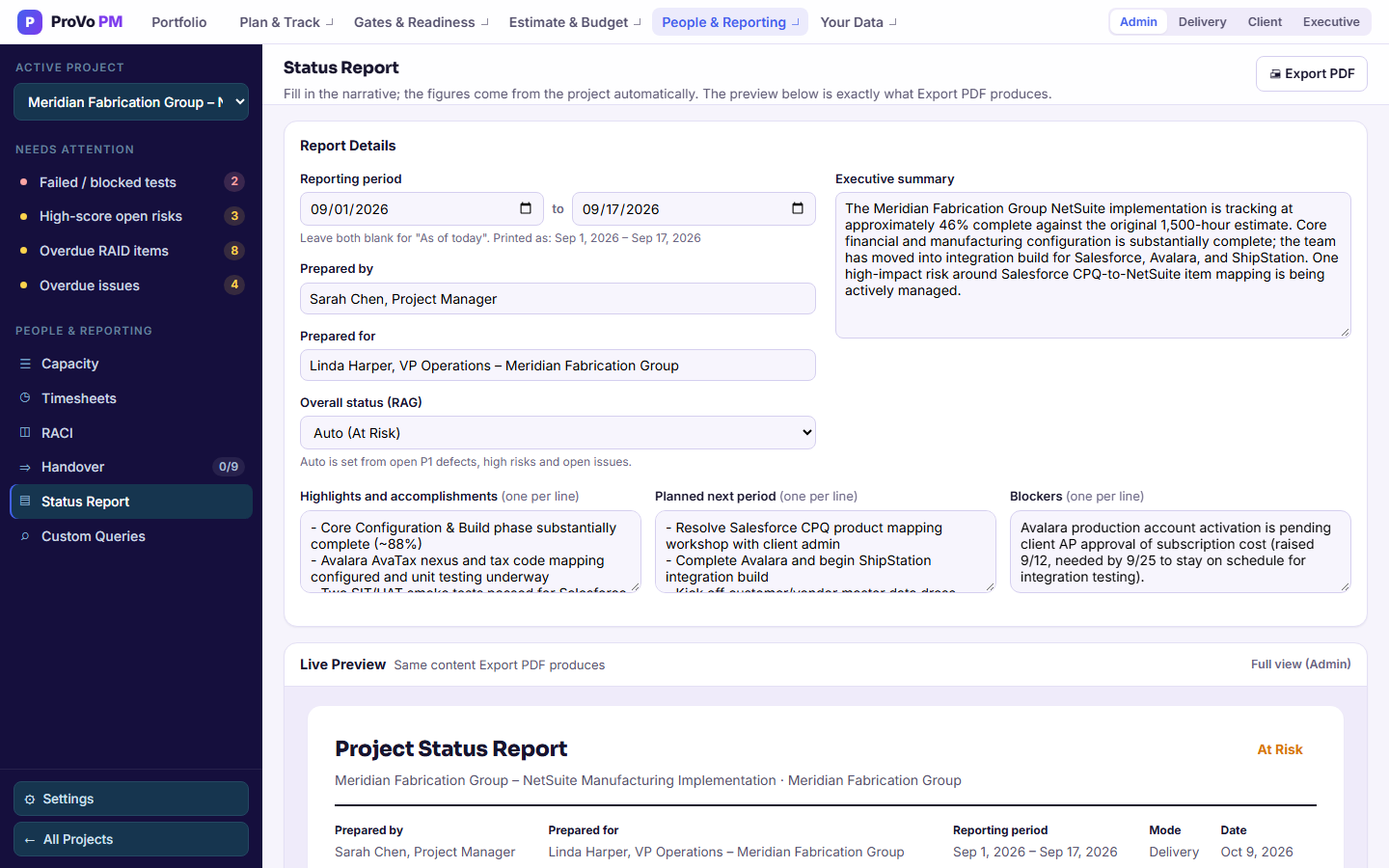
Four text areas take what only you know. Everything else is pulled from the trackers you have already been keeping.
What You Type
- Reporting Period, Prepared by and Prepared For: a from and to date, your name, and who this is going to.
- Executive Summary: optional. Leave it blank and a one-line summary is written from the project figures.
- Highlights: what went well, in your words.
- Next Period: what you are going to do about it.
- Blockers: what you need from them. This is the section clients actually read.
What It Pulls
- Weighted percent complete and phase progress
- Open gates by phase, with status
- The top five open risks from the RAID log with score and mitigation, and the open issue count from Issues & Decisions
- Tests passed against total, and the open P1 defect count
- Migration objects reconciled against total
- The current readiness score
- Planned and actual hours and, for roles with Financials access, a budget block with labor, expense and scope contingency and project total
The RAG Status Derives Itself
| Colour | When |
|---|---|
| Red | Any open P1 defect |
| Amber | An open risk scored high on impact and high on probability, or three or more open issues |
| Green | Neither of the above |
You can override it. The point is not that software knows better than you. It is that going green while a P1 is open becomes a deliberate act with your name on it, rather than the default that happens when a status pack is assembled in a hurry on a Friday afternoon.
Why This Matters
Reports That Disagree with the Plan Are Worse Than No Reports
The usual failure is not that a status report is missing. It is that it is assembled by hand from four places, at speed, and drifts from what the plan says. When the report is generated from the same data as the plan, the two cannot disagree, and the weekly hour spent reconciling them goes away.